Website change monitoring is having an AI moment, and it is easy to miss what actually matters about it. The old promise was "get an alert when a page changes." The new promise is "get an alert that tells you what changed, in a sentence, and whether it matters." That second promise addresses the real reason most monitoring setups die within a month: not missed changes, but drowned ones.
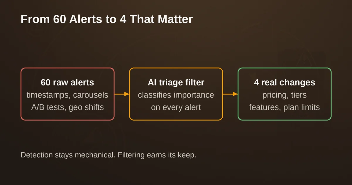
Here is the failure mode. You point a change detection tool at eight competitor pages on a Monday. By Wednesday you have 60 alerts. Fifty-three of them are a rotating testimonial carousel, a "last updated" timestamp, a session cookie banner, and an A/B test variant of the hero headline. Four are real: a pricing tier went up, a feature got renamed, a free plan lost a limit, a new enterprise logo appeared. Those four are buried inside screenshots and red-green diffs alongside the noise, so you skim, you miss one, and by the following week you have trained yourself to ignore the alert emails entirely. The monitor is still running. The intelligence pipeline it was supposed to feed has quietly shut down.
That is false-positive fatigue, and it is the problem the current generation of AI website monitoring tools is actually solving. Not detection. Detection was solved years ago. The unsolved part was triage.
Why raw diffs burn people out
Any page worth monitoring changes constantly, and almost none of the churn is signal. The noise falls into a few recognizable families:
- Timestamps and counters. "Last updated Sep 25," "1,432 people viewing," today's date rendered into a footer. Every one of these triggers a byte-level diff.
- Rotating content. Carousels, testimonials, "related posts" modules, randomly ordered case study grids. Every check produces a different snapshot.
- Experiments. A/B tests on headlines, CTAs, and layouts mean the page you monitor is not one page but two or three, flipping on a coin toss per visit.
- Personalization and geo variants. Currency, region-specific banners, cookie-state differences. Your monitor sees a different page than a normal visitor might.
- Infrastructure churn. Cache-busting query strings, rotating ad slots, third-party widget versions.
A pixel or text diff sees all of this as equally important, because a diff has no concept of importance. It only has a concept of difference. So the burden of deciding what matters lands entirely on you, at alert-reading speed, forever. This is why monitoring setups decay: the cost per alert is small but nonzero, and the hit rate is terrible.
You can fight this with configuration. Select just the pricing table element. Exclude the footer. Write a CSS selector that isolates the plan cards. This genuinely helps, and every tool in this article supports some version of it. But configuration is a one-time bet: the competitor redesigns their page, your selector silently breaks or starts matching the wrong thing, and you find out three weeks later when someone asks why nobody flagged the price change. Monitoring needs a layer that survives page churn, not just a layer that ignores parts of it.
What AI summaries actually add
The AI in modern monitoring tools operates at three levels, and it is worth being precise about which one you are paying for:
- Detection stays mechanical. Screenshots, text extraction, DOM comparison. AI does not replace this, and should not. A model that "notices" a change without a stored baseline is hallucinating.
- Filtering is where AI earns its keep first. Given a diff, a language model is very good at classifying "this is a timestamp and a carousel rotation, ignore" versus "this is a change to the product tiers." That single binary judgment, applied per alert, is what collapses 60 alerts a week into the 4 you would have read anyway.
- Explanation is the visible layer. Instead of a screenshot pair, you get a sentence: "The Enterprise plan price increased from $99 to $129 per month and the starter tier lost its API access." You read the alert in five seconds. You can forward that sentence to a teammate without commentary. You can pipe it into a Slack channel or a webhook and downstream systems get structured meaning, not pixels.
Not every tool that says "AI-powered" does all three. Some use AI for detection sensitivity tuning. Some use it to help you set monitors up. Only a few put a plain-language explanation and an importance judgment on every single alert. That distinction, more than price or check frequency, is what separates the tools that reduce alert fatigue from the tools that merely rebrand it.
The week test: how to judge any monitoring tool in seven days
Feature lists will not tell you how noisy a tool is in practice. Your pages will. Before committing to any plan, run this protocol. It takes about an hour of setup and then five minutes a day.
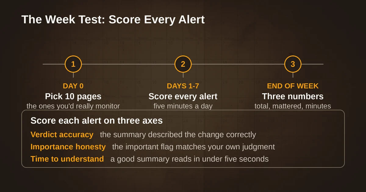
Day 0: pick your 10 pages. Choose the pages you would genuinely monitor for real: three competitor pricing pages, two competitor product or feature pages, two regulatory or policy pages that affect you (your industry's compliance updates, a platform's terms page), one status or changelog page, one page you own but do not control (a marketplace listing, an app store page), and one noisy news homepage as a stress test.
Days 1 to 7: score every alert on three axes.
- Verdict accuracy. Did the alert describe the change correctly? An AI summary that says "pricing updated" when the actual change was a testimonial swap is worse than no summary, because you stop trusting it.
- Importance honesty. Did the tool's important/not-important flag agree with your own judgment? Track your own precision metric: of the alerts it marked important, how many were? Of the alerts you considered important, how many did it catch?
- Time-to-understanding. Seconds from opening the alert to knowing what happened. A raw diff might be 30 to 90 seconds, every time. A good summary is under five.
End of week: three numbers tell you everything. Total alerts, alerts that mattered (your call), and minutes spent. If a tool cannot get your weekly alert load under roughly twice your "mattered" count, either the tool cannot filter or your page selection is wrong, and only the week test distinguishes which.
A practical note: run the same 10 pages through at least two tools simultaneously. Every serious tool here has a free tier or trial that supports this. The comparison is more informative than either tool in isolation, because you learn which alerts are page noise (both tools fire) versus tool noise (only one fires).
The tool landscape, September 2026
All pricing below is as published by the vendors as of this month. Expect it to drift.
Visualping is the tool that has gone furthest toward making AI triage the default rather than a premium add-on. Every alert on every plan, including the free tier, ships with a plain-language AI summary and an important-or-not flag. The free plan covers 5 pages with 150 checks a month (about one daily check per page); the paid ladder runs from a Personal plan at $10 a month (billed annually) with 1,000 checks across 10 pages up to Business plans starting at $100 a month with 20,000 checks and 200 pages, with Slack, Teams, and Google Sheets integrations. Two details worth knowing: the REST API and MCP server are on every plan, free included, so you can have an agent create and read monitors programmatically; and the top Solutions tier adds custom prompts that let you define, in natural language, what "important" means for your monitoring job. Its weakness is the check-budget pricing model: monitor 200 pages at tight intervals and you will feel the caps. For the week test, Visualping is the benchmark the others get measured against, because the summary-plus-flag combination is exactly the fatigue killer the protocol above scores for.
Hexowatch takes the opposite bet: breadth over explanation. It packs 13 monitoring types into one platform: visual, content, keyword, technology stack, source code, availability, price, WHOIS, domain, sitemap, RSS, backlink, and HTML element monitoring. For competitive intelligence, the technology-stack and WHOIS modes do things the others do not, and the price monitoring mode is genuinely useful for e-commerce. The AI layer is positioned as assisting detection and archiving, with before-and-after comparisons, rather than writing you an explanation of each change. Paid plans run from $29 a month (4,500 checks) through $55 and $99.99 tiers, with custom Enterprise pricing above that. Its tradeoffs are a steeper learning curve, and users report the visual modes can false-alert on slider and carousel content, which is precisely the noise family you are trying to escape. Choose it when you need to monitor the fact of change across many dimensions; choose something else when you need each change explained.
Distill Web Monitor is alive and actively maintained, which is worth stating plainly because its 2010s-era reputation makes it easy to assume otherwise: the Chrome extension is current at version 4.1.0 with roughly 400,000 users, and the mobile app got a substantive update in August 2026. Its model is local-first: the browser extension or desktop app does the checking from your machine, free and unlimited, with a smaller cloud allocation for 24/7 coverage (the free tier includes 25 monitors, 5 of them in cloud; paid plans start at $15 a month). The August 2026 update added an AI assistant, but read the fine print of that phrase: it helps you set up monitors from plain-language descriptions. It does not summarize alerts. In the three-level model above, Distill does detection well and filtering through manual selectors, but its alerts are still diffs you read yourself. For a developer or researcher watching a handful of pages from their own browser, the price (free) and the element-selection tools are hard to beat. For a team that needs explained alerts in Slack, it is not that tool.
Wachete splits the difference on pricing philosophy: instead of a monthly check budget, you pay per page and interval, and every page is checked at its interval around the clock for the whole billing period. If you have lived through the experience of burning a check budget by tightening one monitor's frequency, that model is quietly liberating. The free tier covers 5 static pages, it handles login-protected and dynamic pages, keeps 12 months of history with charts, and connects to Zapier, an API, and AI assistants. One caveat as of this writing: Wachete's pricing page itself was not loading when checked, so verify current paid tiers directly before committing. It is a solid, no-drama pick for page-count-based monitoring; it is not the leader in AI explanations.
changedetection.io deserves a slot in this landscape for a different reason: it is the open-source option, and it has recently grown the same AI layer the commercial tools sell. The self-hosted version (Apache 2.0, free, unlimited monitors via Docker) has had CSS/XPath/regex filtering, price and restock detection, and 85+ notification channels for years. Since June 2026, the hosted service at $8.99 a month includes LLM-powered change summaries and noise filtering, with a provider-agnostic backend: bring your own GPT or Gemini API key, or run the summarizer entirely locally through Ollama or vLLM. That last option is unique in this group: if the pages you monitor are sensitive (procurement, legal, unreleased-product pages), you get AI triage without your page contents leaving your infrastructure. The cost is setup and maintenance; the gain is unlimited pages and data sovereignty.
A decision rule, and what the week test usually reveals
If you take nothing else: pick the tool whose alert you would actually forward to a colleague. That is the whole game. Concretely:
- Most teams monitoring competitors: start with Visualping's free tier and run the week test. The summary-plus-flag on every alert is the current standard for explained changes, and the free plan is enough to know if it works on your pages.
- Monitoring many dimensions (tech stacks, domains, backlinks, availability): Hexowatch's 13 modes are unmatched, budget for the learning curve and expect to tune carousels out manually.
- Developers watching a few pages from their own machine: Distill's free local checking is still the path of least resistance.
- Predictable per-page costs or login-protected pages at moderate scale: Wachete's no-check-cap model deserves a look.
- Sensitive pages, high page counts, or a Docker habit: changedetection.io self-hosted, with a local LLM for summaries if you need the filtering.
One honest caveat about the AI summaries themselves: they are language models, and language models occasionally misread a diff. During your week test, deliberately check a few summaries against the underlying screenshots. When a summary says "pricing unchanged," and the diff shows a $10 increase, that is disqualification material. The tools that show you the raw evidence alongside the AI judgment, rather than replacing it, are the ones that survive that check.
Pricing and plan details are as published by the vendor around September 2026 and can change: confirm on the official site.
Two questions people actually ask
Do I need AI summaries if I can just select the exact element to watch? Element selection removes some noise (footers, carousels) but not all of it: A/B variants, currency switching, and redesigned pages still break through, and selectors themselves rot when layouts change. AI filtering is the layer that keeps working after the page stops matching your configuration. The two approaches work best together: select the pricing table, then let the model summarize what happened inside it.
Is anyone in this space dead or gone that I should stop recommending? As of September 2026, the core tools are all alive and shipping: Visualping is adding custom-prompt AI at the top end, Distill shipped a major app refresh in August 2026, Wachete is running, Hexowatch is on version-year 2026 pricing, and changedetection.io is actively maintained on GitHub. The consolidation risk runs the other way: the free and cheap tiers are generous enough that the bigger question is which one you will still be reading alerts from in six months.