
Every month, someone in your company pastes a chart into a slide and writes "Revenue up" under it. That sentence is doing enormous amounts of uncredited work. Somebody summed the right rows, chose the right comparison window, and noticed that the spike came from one region while three others quietly declined. When an AI writes that sentence instead, the question that decides everything is whether it did the arithmetic or just imitated the vibe of a business report.
That is the gap between the two things people mean when they say "AI reporting." One is dashboards: charts generated from a real data connection, which are hard to fake because the pixels come from the data. The other is narrative: prose that claims a number means something, which is trivially easy to fake because prose generation is exactly what language models do. A good AI reporting setup forces both, and more importantly forces the prose to show its arithmetic. This post walks one small KPI dataset through the whole pipeline, from CSV to dashboard to executive summary, and shows where Power BI Copilot, Tableau Pulse, Hex, and Julius each sit, and how to check every number the machine hands you.
The pipeline: from raw data to a report people can act on
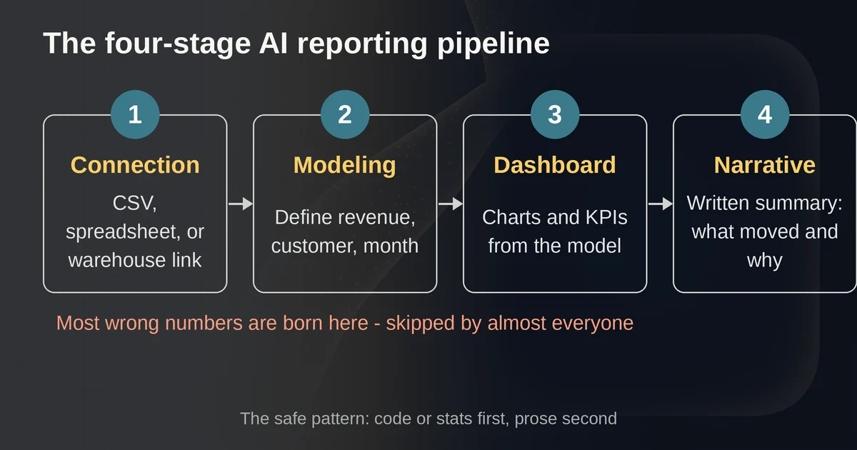
Strip away the vendor talk and every AI reporting tool is some slice of the same four-stage pipeline:
- Connection. Raw data has to get into the tool: a CSV upload, a spreadsheet, or a governed connection to a warehouse like Snowflake, BigQuery, or Postgres.
- Modeling. The tool needs to know what a "customer" is, which rows count as revenue, and what a month means. This is the stage everyone skips, and it is where most wrong numbers are born.
- Dashboard. Charts and KPIs generated against that model, refreshed when the data changes.
- Narrative. A written executive summary that explains what moved, why it probably moved, and what it means.
The interesting design question in 2026 is no longer whether AI can do each stage. It can. The question is which stages the AI genuinely does from data and which it fills in from language habits. The one reliable divide: if the tool runs actual code, a query, or a statistical routine against your data before it writes, its numbers are checkable. If it looks at a chart and writes about it, its numbers are plausible. You need the first kind anywhere near your board deck.
One dataset, start to finish
To make this concrete, here is a small SaaS KPI set we will use for the rest of the post. It is an example dataset, but every figure in it is internally consistent, which is exactly what makes it useful for catching an AI making things up.
Six months of revenue, subscribers, churn, and acquisition cost, January through June 2026:
| Month | Revenue ($K) | Active subscribers | Churn % | CAC ($) |
|---|---|---|---|---|
| Jan | 182.4 | 1,240 | 3.1 | 214 |
| Feb | 189.3 | 1,289 | 2.8 | 221 |
| Mar | 187.1 | 1,301 | 3.4 | 236 |
| Apr | 199.8 | 1,352 | 2.6 | 208 |
| May | 208.5 | 1,408 | 2.4 | 197 |
| Jun | 214.2 | 1,441 | 2.2 | 191 |
The correct summary of this data, the one an analyst would write, looks like this: H1 revenue totals $1,181,300, up 16.3% over the $1,015,300 second half of 2025, with June revenue up 17.4% over January. Growth is compounding from two healthy sources: subscribers grew 16.2% while monthly revenue per subscriber crept from about $147 to $149. Churn improved from 3.1% to 2.2%, and CAC fell 10.7%, so the growth is getting cheaper, not just bigger. The one wrinkle: March is the only down month, a 1.2% dip in revenue that coincided with the year's peak churn of 3.4% and peak CAC of $236.
Notice what that paragraph does. Every sentence carries a number, and every number is traceable to rows in the table. That is the standard. Hold any AI tool to it and you can separate the useful ones from the decorative ones in about ten minutes.
Where each tool sits in the pipeline
Julius: analysis first, prose second
Julius is the tool in this group built most explicitly for the "CSV in, finished report out" job. Its report generator runs the analysis in code against your uploaded file first, then writes the report around the results it actually computed, and explicitly claims every chart and number traces back to the source. Whether that claim holds every single time is your job to verify, but the architecture is the right one: the prose is downstream of the computation, not a substitute for it.
On our dataset, you upload the CSV and ask for an executive summary. Julius writes Python, computes the H1 total, the growth rates, the ARPU, and hands back a structured document with an executive summary section, charts, and tables that paid plans can export as a shareable report or even a presentation. Because it is conversational, the follow-up is where the value is: "March is down. Which KPI drove it?" and it will go compute the answer rather than speculate. Julius now bills in credits rather than messages, with Plus at $20 a month including 2,000 monthly credits and Pro at $45 with 5,000, and paid plans covering report and dashboard exports. If your reporting job starts with "someone emailed me a spreadsheet," Julius is the shortest path in this list.
We looked at Julius and its spreadsheet-focused peers in more depth in our comparison of AI spreadsheet tools, which covers the same analysis-first pattern when the deliverable is the workbook itself.
Hex: the notebook-to-dashboard path for data teams
Hex sits a stage earlier in the pipeline. It is a collaborative analytics workspace where the source of truth is a notebook of SQL and Python cells, and its Magic AI writes that SQL or Python from natural language. The deliverable is a Hex App: curated cells from the notebook published as a dashboard, report, or interactive data app, with the code hidden from stakeholders but never thrown away.
That last clause is why Hex earns the number-integrity vote. In most dashboard tools, the chart and the calculation behind it live together and the calculation is easy to lose. In Hex, the chart is a projection of code that stays in the project, so any number on the dashboard can be traced back to the query that produced it, and re-run. In September 2026 Hex shipped two changes that matter for reporting specifically: stakeholders viewing a published app can now chat with it, asking follow-up questions that open an agent thread without leaving the app, and scheduled notifications can include a CSV export so the monthly digest carries the underlying data, not just the prose. Pricing runs from a free Community plan through Professional at $36 per editor a month to Team at $75, with Enterprise custom.
Hex is the right answer when the report needs to be repeatable and owned by a data team: the June dashboard refreshes itself, the narrative gets rebuilt from new code runs, and nobody is ever copying numbers out of a chart legend by hand. It is the wrong answer if your data lives in a CSV on somebody's laptop and the audience is one meeting.
Power BI Copilot: charts and narratives inside the enterprise stack
Power BI's Copilot now covers both halves of the pipeline. On the dashboard side, it will create and edit report pages from natural language: describe the report you want, or use "Suggest content for this report" to have Copilot evaluate the model and propose pages, then keep prompting to add, change, or delete visuals. On the narrative side, the Copilot narrative visual summarizes an entire report, a page, or a selected visual, with adjustable tone and specificity.
The catch is a single sentence in Microsoft's own documentation, and it deserves to be quoted in full because it defines the integrity model: the narrative visual "pulls information from what is on the report canvas, not the underlying semantic model." Your executive summary is written from the charts, not from the data. That means badly named measures and vague axis titles do not just make ugly dashboards, they actively corrupt the narrative, because the prose inherits whatever the canvas appears to say. Microsoft's docs are refreshingly blunt about the other half of the deal too: read through the summary to make sure it's accurate.
There is also a hard gate. Copilot requires a paid Fabric capacity (F2 or higher) or Power BI Premium capacity, an admin-enabled tenant setting, and a supported region; trial and free SKUs are excluded. Within that fence, the direction of travel is unmistakable: Microsoft is retiring the old Q&A natural-language experience in December 2026 and pointing everyone at Copilot, and at Build 2026 it announced Agent Skills for Power BI, which let an AI agent build and refine both the semantic model and the report itself, starting from plain language or even a screenshot. If your company already runs Power BI, none of this costs a new tool decision. If it does not, the capacity requirement makes Copilot the most expensive way in this list to summarize a 36-row CSV.
Tableau Pulse: metrics that write to you, carefully
Tableau Pulse takes a different bet on the whole problem. Instead of asking you to build the dashboard, Pulse inverts it: you define the metrics you care about, follow them, and Pulse sends digests of personalized insights to your email or Slack, complete with breakdowns by dimension and a guided question-and-answer path for digging into any insight.
The most interesting thing about Pulse in September 2026 is an architectural honesty that is rare in this category. In July, Tableau upgraded the agent inside Pulse (formerly the enhanced Q&A experience) to GPT-5.2, and its documentation states plainly that the model does not analyze your data. Instead it draws on pre-calculated insights rooted in statistical analysis done by Tableau. Read that again, because it is a design pattern, not a limitation: the language model narrates verified numbers, it does not produce them. The statistics run against the metric definition you set up; the LLM turns those into English you can follow up on. That is the compute-then-write pattern from the top of this post, with the compute step deliberately held by the platform rather than the model.
Pulse requires Tableau Cloud, and the deeper AI capabilities can be trialed for 60 days with the Try AI site setting that admins can scope to specific user groups. It fits the company that already runs Tableau and wants monitoring to push to people rather than people pulling dashboards. For a one-off CSV report, it is the wrong shape entirely.
The recompute check: ten minutes that saves your credibility
Here is the part of the post to actually bookmark. Whatever tool wrote your executive summary, run this check before it leaves your hands.
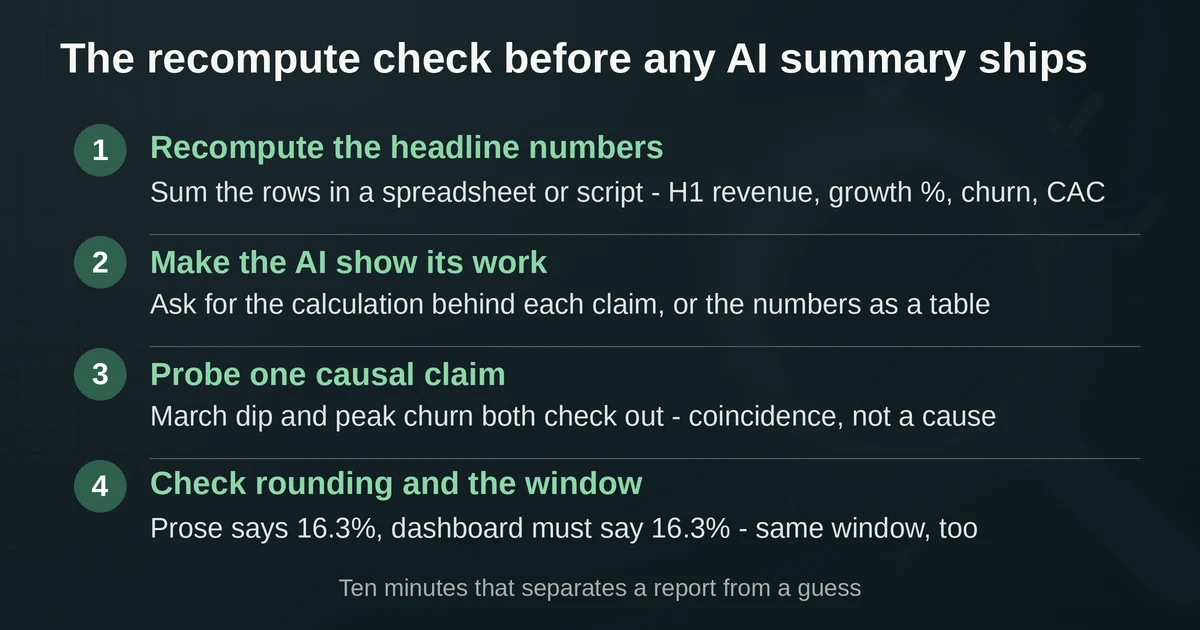
Step 1: recompute the headline numbers yourself. Not in the AI tool, in something dumb and trustworthy: a spreadsheet, a quick script, a pivot table. The headline of our example summary claims H1 revenue of $1,181,300 and 16.3% year-over-year growth. Sum the six revenue rows: you get $1,181,300. Divide by the prior-half figure: you get 16.3%. Repeat for subscriber growth (16.2%), churn (3.1% to 2.2%), and CAC (down 10.7%). Any number in the prose that cannot be reproduced this way either comes from data you did not paste in or was invented. Both are disqualifying until resolved.
Step 2: make the AI show its work. In Julius or Hex, ask the tool to print the calculation behind each claim, or better, ask it to output the numbers as a table alongside the prose. In Hex the calculation already exists as code you can read. In Power BI, remember the narrative reads the canvas, so spot-check the prose against the visuals it had in front of it. If the summary says "March declined due to churn," ask what churn was in March. The correct answer is 3.4%. A tool that hedges, or that answers with a number not in your data, has told you everything.
Step 3: probe one causal claim. Narrative tools love to explain. Our example says March's dip coincided with peak churn and peak CAC. Check it: March churn is 3.4%, the year's high, and March CAC is $236, also the high. The claim survives because the numbers support it, and note the word "coincided." Correlation across three data points is a hint, not a finding, and a trustworthy summary says so. When an AI asserts a cause your data cannot support, that sentence should not survive your edit.
Step 4: check the rounding and the comparison window. A surprisingly common failure: the prose rounds 16.34% to "almost 17%" while the dashboard shows 16.3%, and suddenly two artifacts of the same analysis disagree with each other in front of the CEO. And confirm the window: "up 16.3%" means H1 2026 versus H2 2025 in our example. A summary that lets the reader assume it means year-over-year calendar comparison is wrong even if every digit is correct.
This check exists because language models are smooth. A hallucinated number in a report reads exactly like a verified one; fluency carries no information about accuracy. The tell is never the writing quality, it is whether the writing is load-bearing on a computation. If you want to go deeper on why models produce confident nonsense, we cover the mechanics in why AI hallucinates, with real examples.
How to choose in about sixty seconds
| Your situation | The right tool | Why |
|---|---|---|
| CSV in, board-ready report out, one analyst | Julius | Analysis-first architecture, fastest from file to executive summary |
| Repeating monthly report, data team owns it | Hex | Notebook-backed apps, code always behind every number, scheduled exports |
| Company already on Power BI with Fabric capacity | Power BI Copilot | Native, no new procurement; mind the canvas-reading narrative |
| Tableau Cloud shop that monitors a fixed set of KPIs | Tableau Pulse | Pushes insights to email and Slack; LLM narrates pre-calculated stats |
Two honest footnotes to that table. First, if your data already lives in a warehouse and your team speaks SQL, the natural-language querying tools we covered in our AI SQL and data analyst tools guide are often the better upstream stage, with the dashboard tool of choice downstream. Second, Google's Looker Studio has Gemini-powered features in its Pro tier for teams already in that ecosystem, and is worth a look as the free end of the spectrum, but the compute-then-narrate discipline above matters there just as much.
The price points tell their own story: a solo analyst can run this whole pipeline for the cost of a Julius Plus plan, a data team can stand up governed, self-refreshing reports for $36 per editor on Hex, while the enterprise paths (Fabric capacity, Tableau Cloud plus AI) are priced for companies that were paying anyway.
Two questions people actually ask
Can I trust AI-generated numbers in a report going to executives? Trust the pipeline, not the prose. If the tool ran real code or statistics against your data before writing, and you can recompute the headline numbers in two minutes, the prose is a time-saver. If the tool only looked at charts and wrote about them, treat its output as a first draft with unverified arithmetic. No vendor's marketing changes this division; only the architecture does.
Do I still need a human analyst if I use these tools? You need about ten minutes of analyst per report, which is the recompute check above. What you stop needing is the analyst's typing: the chart building, the formatting, the first draft of the prose. The judgment calls, the causal claims, the "this number is wrong and I know why," stay human, because they are the part that carries the blame when the summary is wrong.
Pricing and plan details are as published by the vendor around September 2026 and can change. Confirm on the official site before you budget.